Jul182009
Head to Head Highlighters
Filed under Pens by Kim at 6:05 pm on Jul 18 2009
I’m about to show you just how ridiculous it can be to be me. Pen bloggers, at least, will understand… I hope…
About a week ago, the Office Supply Geek posted a fabulous highlighter refilling tutorial which reminded me that I have been saving up a post about highlighters for a while now. This is because I found my holy grail of highlighting. I am interested to see if the pen nuts out there agree with me.
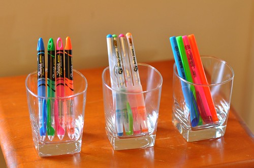
At my office, I found a pack of the middle guys – the Bic Brite Liner Z4 – sitting around in a conference room. They’d been there a few days, and I needed highlighters, so I snagged them. I do a great deal of document review at work and these are an essential tool in my arsenal, so it was to my delight that I found that these puppies behaved like no other highlighter I’d ever used. When they were all getting close to empty (and I love being able to see that happen as I use them up!) I went looking in stores for replacements. Nada. Couldn’t find ’em. But I saw Bic Brite Liners (on the right) and thought maybe they’d just changed the form.
Nope. There are big differences between a Brite Liner and a Brite Liner Z4, it turns out, not the least of which is the see-through business. I also picked up these Sharpie Accents because I have a great deal of faith in that brand, and because I have a disease that causes me to not be able to walk out of a Target without spending at least $60. I know, it’s tragic. So let’s see how they stack up:
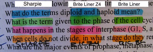
The two on the right, the Bics: this is like night and day to me. See the clearance above and below the letters that you get with the Z4? I’m pretty sure this is 12 point typeface. Some might be put off by the tendency with the Z4 to overlap the line below with the line above, but I prefer that. Once you’ve taken in the fact that you can’t clear the tops and bottoms of letters with the ordinary Brite Liner, note the wimpyness of the colors as compared to the Z4. The orange and the green seem close-ish, but why accept less than the brightest? If you’re me, that is.
The Sharpie seems to straddle the middle. The chisel tip lays down a slightly taller line, but nothing like the Z4. The brightness is merely OK. I think it would do, if I didn’t know how lively the Z4 ink can be. But now let’s get into the real nitty gritty – what happens when you press that tip to the paper. To be kind, I’ve put the rest of this behind a cut – including chisel tip pictures.
First off, the Sharpie. There’s not any movement, and give to the tip. It is nice that the l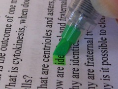 iquid ink doesn’t pool under the tip the way some others do. But you can clearly see from this image that while you might clear the tops of the tall letters, you can’t also clear the bottom of the small letters. Probably this bothers no one else in the world but me, but I find it distracting when the line is narrower and it’s harder to keep it over the whole letter.I should also note that these have a convenient ring at the end for putting in binders or on a keychain – that’s a nice touch.
Now let’s look at the Brite Liner Z4. This picture shows why this thing is my holy grail of highlighting. You can see that the ink is flowing very fast. You can see how wet the chisel tip is before the thing even hits the paper. And you can see that it has movement – it settles on the 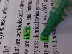 paper and fans out a little, not unlike a stiff brush. I know this feature isn’t for everyone but I love it! There is clearance above the tall letters, and below the letters as well. You’re probably not going to miss and highlight only half the letters with this, something that irritates me when I do it. The only down side: You leave it sitting in one spot for any length of time and it WILL soak right through the paper. Doesn’t bother me, but will certainly be an irritant to someone else.
Finally, the Brite Liner which I mistakenly bought. This is the wimpy, generic form of highlighter line. Not very tall, not very bright, very stiff chisel tip. 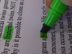 The ink looks really dark in this picture, but it fades on drying. Plus it’s pretty unsatisfying to see the dark ink laying down when you’re trying to draw attention to something. I plan to continue to use these at work to use them up, but I wouldn’t buy them again.
I did an set of pictures of the writing tips of the orange pens as well: Sharpie, Z4, and Brite Liner.
I will say this: the Office Supply Geek is right. It is a far better option to refill than to keep throwing away more plastic pen bodies. Having not realized this was an option, I might have done that. Since I plan to enter nursing school soon enough, I’ll probably be using up quite a bit of brightly colored ink, and I hate the idea that I might be adding even more crap to the pacific trash gyre.
You can also check out this review of the Frixion highlighters over at the Pen Archives. For now… I have a LOT of highlighting to do to use these up.
1 dowdyismon 18 Jul 2009 at 6:34 pm
Awesome review Kim! I think I am going to have to hunt down a pack of those Z4s.
[Reply]
Kim Reply:
July 18th, 2009 at 10:42 pm
The only place I’ve been able to find them since the first time is Amazon. I haven’t seen them in any store!
[Reply]
2 Daniel M. Laenkeron 18 Jul 2009 at 7:23 pm
Forgive me for being anal-retentive, but I think it bothers me a little that the Z4 is actually making the page damp.
That said, the original Brite Liner is just unacceptable. I think I’d go with the Sharpie, but any refillable quality highlighter is good in my book.
[Reply]
Kim Reply:
July 18th, 2009 at 10:44 pm
I can totally understand that objection. It’s a valid one. I just happen to prefer the brush-like feel and very wide line more than I care about too much inkflow. I should have taken a pic of the bleedthrough! Der.
[Reply]
3 Graceon 28 Jul 2009 at 3:27 pm
I actually kind of hate highlighters as a rule, but I have great respect for your comparison. I’d like to see one re: ink pens as well. There’s a topic I have strong preferences about!
[Reply]
Kim Reply:
July 28th, 2009 at 6:07 pm
The pen blogosphere is vast and mighty, so you can definitely find lots of pen samples and comparisons. I really need to update my blogroll! Check these out if you feel like:
http://www.penaddict.com/
http://officesupplygeek.com/
from there, the blogrolls will guide you!
[Reply]
4 Passionon 30 Jul 2009 at 9:32 pm
Thanks for linking to my blog and I loved your review. You really covered all the aspects.
[Reply]
Kim Reply:
July 30th, 2009 at 9:36 pm
Yay!! Thank you for stopping by and commenting!
[Reply]
5 The First Carnival of Pen, Pencil and Paper | Notebook Storieson 04 Aug 2009 at 7:08 am
[…] presents Head to Head Highlighters posted at Prosaic Paradise. Nifty says: you don’t see too many side-by-side highlighter […]
6 Andrewon 04 Aug 2009 at 7:22 am
Great Review! You really hammered out the details of each highlighter. The BIC Z4 really looks like the way to go in this comparison.
[Reply]
7 Janceon 05 Oct 2009 at 8:28 pm
They actually just changed the name of the Z4, it is now Brite Liner +, same number, and a slight redesign in the handle, but works the same. The model # is identical to the Z4. I ordered some on line and was surprised when I got a mix of old and new, but turned out that they are the same.
[Reply]
Kim Reply:
October 5th, 2009 at 8:35 pm
Thanks for the heads up! I would be pretty sad if I lost track of how to get these.
[Reply]
8 Ann-Kat (Today, I Wrote...)on 22 Nov 2009 at 10:24 pm
I just found this post from another blog and I have to say “here, here!” You aren’t alone in many of your hilighting quirks. I’ve used the Brite Liners (actually have two sets to get through) and your assessment is perfect.
I actually fell in love with a set of Staedtler highlighters (though the height wasn’t *quite* tall enough for me…but in its defense, they were the mini highlighters), but I haven’t been able to find replacements. So, I must say thanks for the tip about refilling!
[Reply]
Kim Reply:
November 24th, 2009 at 10:38 am
Yay! Thanks for leaving a comment! I’m glad it’s not just me.
I found that the nib of the refillable ones is not very big but if you can put up with that it’s a nice flow.
[Reply]